

Building a better user experience
Having a website is essential, but having a website that people love to visit is even better. With so much competition, it’s important to stand out from the crowd and ensure your website visitors have an enjoyable and memorable experience. That’s why we’re here to help you spice up your website and create a better user experience.
Let’s start by listing the main areas of concern on your website:
Navigation
Good navigation helps users find what they are looking for quickly and easily. It includes clear menus, links, and buttons that are easy to understand and follow. Well-organized and intuitive navigation helps users find what they’re looking for, leading to a better user experience.
Load speed
A user expects a website to load quickly, and a slow-loading website can be frustrating and may lead to users abandoning the site altogether. A fast-loading website enhances the user experience by keeping users engaged and reducing the likelihood of them leaving before they can explore the site. In fact, a site’s bounce rate probability increases by 32% as the page load time moves from one to three seconds.
“You have seven seconds to get your user’s attention. If you waste seconds on page load time, people leave and conversions plummet. We work to optimize everything possible—from image optimization to efficient plugin use to server settings and everything in between to get pages loading as fast as possible.”
Nicholas LaPolla, Web Development Lead
Page flow
Does it all make sense together? A good page flow guides users through the site’s content and helps them understand how different pages relate to one another. A well-designed page flow ensures that users can easily navigate a site and find the information they need without feeling lost or confused.
Content and readability
Quality content that is informative, engaging, and relevant to the user’s needs can keep users on a site for longer, while poor content can cause users to leave. Readability is also important as it ensures that users can easily understand and engage with the content presented. And of course, whether you’re writing ad copy or organic content for the web, always do your research and use relevant keywords.
Page layout
An excellent page layout ensures that the content is easy to read and understand and that the most important information is easily visible. A well-designed page layout also provides a professional and visually appealing look and feel.
“Design plays a crucial role in how users experience a website. A well-designed website encourages interaction and ensures the user can easily navigate and find the information they are looking for.”
Rheana Hersey, Director of Creative Services
Colors and contrast
Colors and contrast are important in creating a visually appealing and engaging website. Using color thoughtfully can draw users’ attention to essential elements and create a visual hierarchy that makes it easy to understand the site’s content.
Mobile optimization
Did you know that 58.43% of all web traffic comes from mobile users? With an increasing number of people accessing websites via their mobile devices, ensuring a website is optimized for mobile is crucial. A mobile-optimized site is easy to navigate on a smaller screen and loads quickly, ensuring that users have a good experience regardless of their device.
Whoa, still with us? Now that we’ve covered the basics let’s dive deeper into a few areas. We’ll start with site navigation.
Make your site easy to navigate
Good navigation should explain itself to the user. Here are a few good examples:
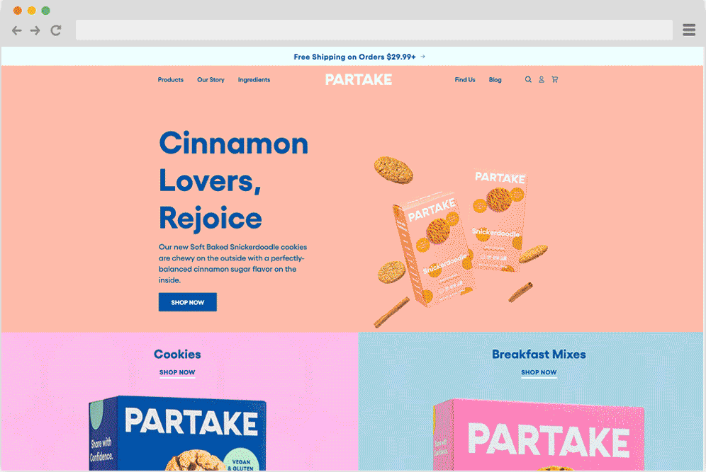
Partake Foods
We don’t just love this website because it has cookies. Partake, the baking company, has a visually appealing yet straightforward navigation system. As you browse their product offerings, each option is accompanied by a striking visual representation. This feature aids customers in identifying their desired products and locating the corresponding pages while simultaneously adding an interactive element to the navigation by enhancing its visual appeal.
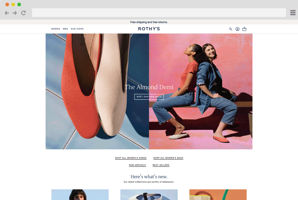
Rothy’s
Alrighty, next up on our list is Rothy’s—a sustainable company that designs killer shoes for women and kids. Their navigation system is a perfect example of mobile-friendliness. They’ve nailed it with a hamburger menu that’s super easy to open on mobile devices. Say goodbye to navigation struggles and hello to really cute shoes.
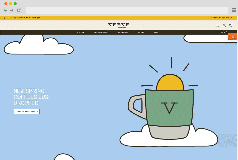
Verve Coffee Roasters
First cookies and then coffee? What can we say, they go great together. But seriously, let’s talk about Verve. This java joint has got it goin’ on (online). They totally nailed the whole “consistent branding” thing. By using the same font style and color scheme throughout, they’ve created a super sleek and modern vibe. And the best part? It’s all seamlessly integrated into their navigation.
The design should be about the user
It’s all about YOU, the user. Let’s talk about why putting the user first in web design matters. Not only does it make your website more enjoyable to use, but it also helps you achieve your business goals. After all, if users can’t find what they’re looking for, they won’t stick around. So, what can you do?
Research, baby. That’s right. Before you start designing, do your homework. Find out what your users want, what they need, and what they’re looking for. Then, use that information to make informed design choices. Trust us; everybody wins when you design with the user in mind.
Be creative with your text and make it scannable
It’s time to ponder the secrets of writing for the web. How do you keep your readers engaged, informed, and coming back for more? It’s simple—write for the internet, not for your high school English teacher. That means keeping it concise, relatable, scannable, and SEO-optimized.
Let’s face it; nobody wants to read a giant text block, so break it up with headings, subheadings, and bullet points. If you wouldn’t read the copy, your customer probably won’t either, so use your judgment as a guide.
Also, remember to add some personality to your writing. Whether it’s punny or a pop culture reference, injecting humor into your content can go a long way if it aligns with your brand voice.
Optimize your site for mobile use
If your website isn’t optimized for mobile, you are missing out on a massive piece of the pie. And we love pie. So, it’s time to step up your game to create a better user experience. Your users aren’t all sitting at a desk with a giant monitor in front of them anymore.
That’s a big nope. Our websites need to be optimized for mobile, with clear and easy-to-tap buttons, fonts that are big enough to read, and a layout that makes sense on a smaller screen. So, the next time you design a website, remember to put yourself in your user’s pocket.


